How to correct red and green colour casts in Lightroom / HSL and Camera Calibration

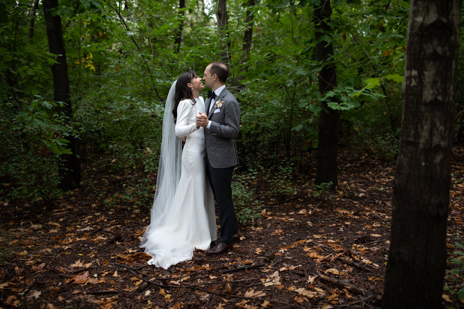
I think most portrait photographers would agree with me when I say that the dealing with colour casts coming off a red brick wall and green grass are are a classic pain in the butt. To be honest, most of the time when I shoot I like to position my subjects away from potential colour correction headaches - but sometimes the brick wall is irresistible and a shooting in a forest is always so worth it.
When editing a portrait session in Lightroom, I used to rely on using adjustment brushes to alter saturation, tint, temperature, and add a neutralising colour to specific areas, but this is time consuming and only feasible for a small number of hero shots. More recently I’ve started learning and experimenting with colour correction techniques in the HSL and Camera Calibration - with edits that can be synced across multiple photos.
Before I go on I want to explain that I don’t necessarily want to get rid of all the colours from the environment reflecting onto the skin- after all I want the photo to look natural and authentic (rather than as if it was shot in a studio and stitched in), I just want for the colour casts to look less crazy and the skin to look more like skin.
CORRECTING FOR RED COLOUR CASTS
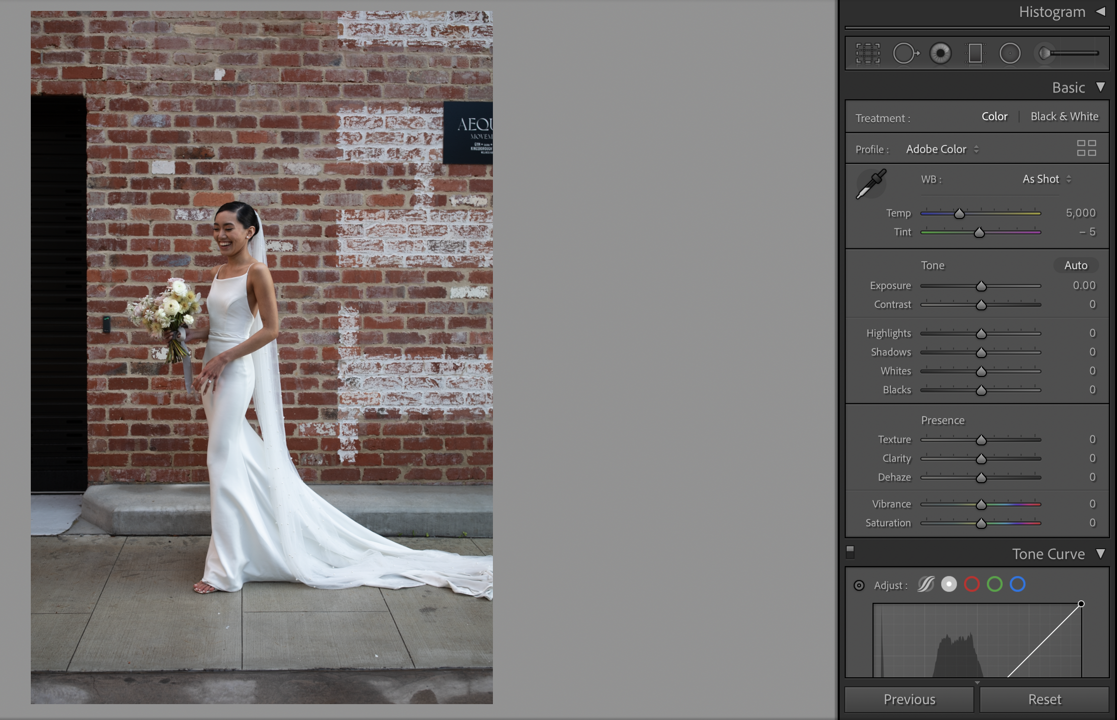
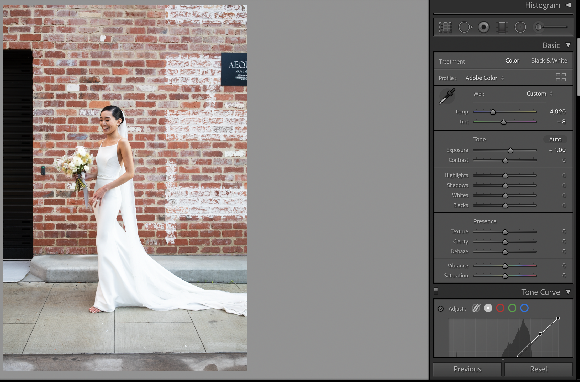
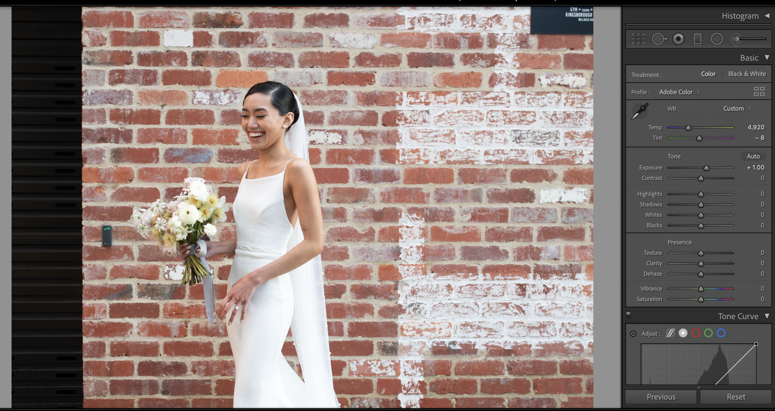
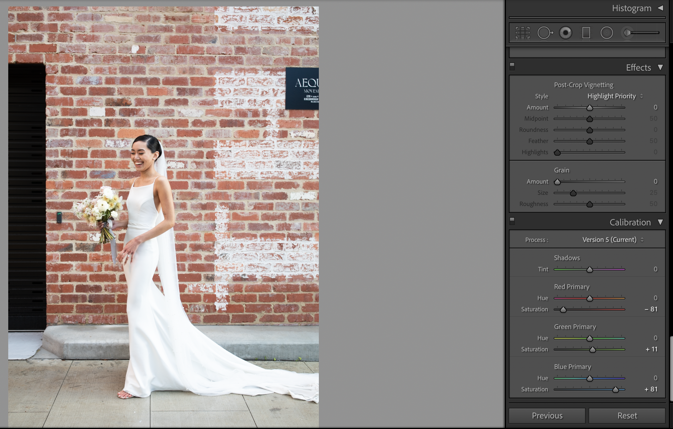
Image on the top left is straight out of the camera. As you can see, there is the expected red colour cast on the subject’s skin from light reflecting off the brick wall. On the right image, I’ve adjusted the tint and colour temperature to colour balance the image, and brought up the exposure- unfortunately this doesn’t completely neutralise the red cast and pushing it any further towards green / cooler temp will just cause the dress and her skin tones on the right of the image to pick up too much green and blue.
The Camera Calibration Panel and HSL sliders are what I’ve found to be the most effective and natural way to achieve a more natural skin tone- I’ll go through some examples of incorporating these adjustments to an image straight out of camera, as well as to images with a stylistic preset applied.
You can of course finish it off with brushes, or take the image into Photoshop for more intensive pixel surgery.
If you are editing a session from scratch you would start with a RAW image that has the right white balance ( tint/ temp), make the colour correction adjustments below, and then build your stylistic edits from that.
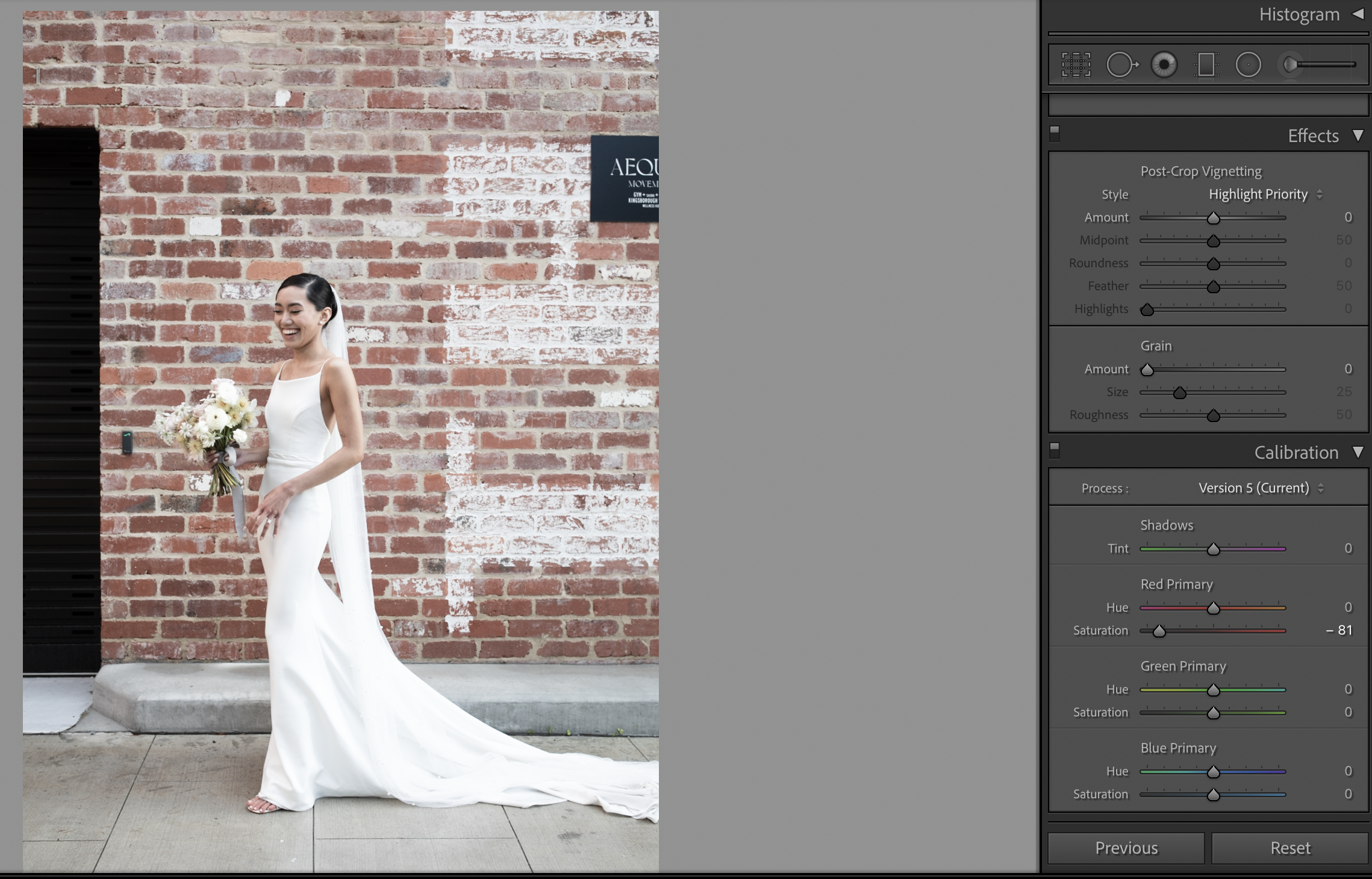
Camera Calibration
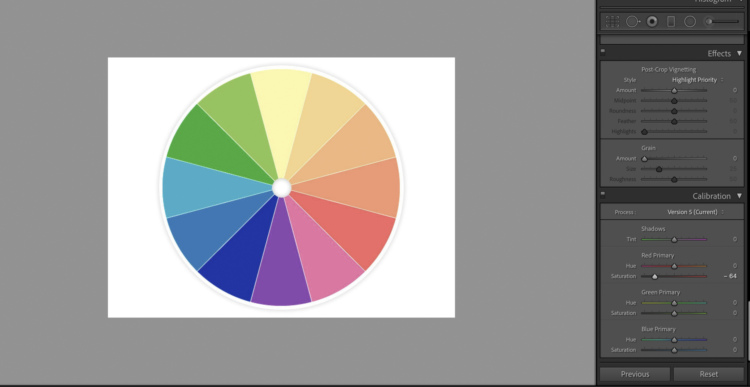
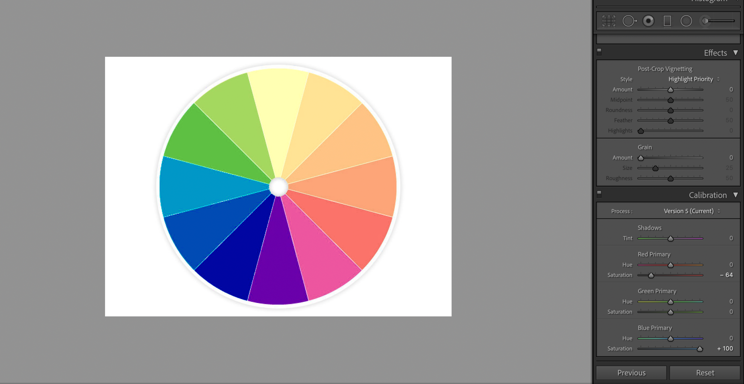
Reduce Saturation in ‘Red Primary’. In my image (see gallery above) I started out pulling it right back to - 81. This pulls red out of all the pixels in the image, which also leads to desaturation in oranges and yellows. Don’t worry if your subject looks like death at this point.
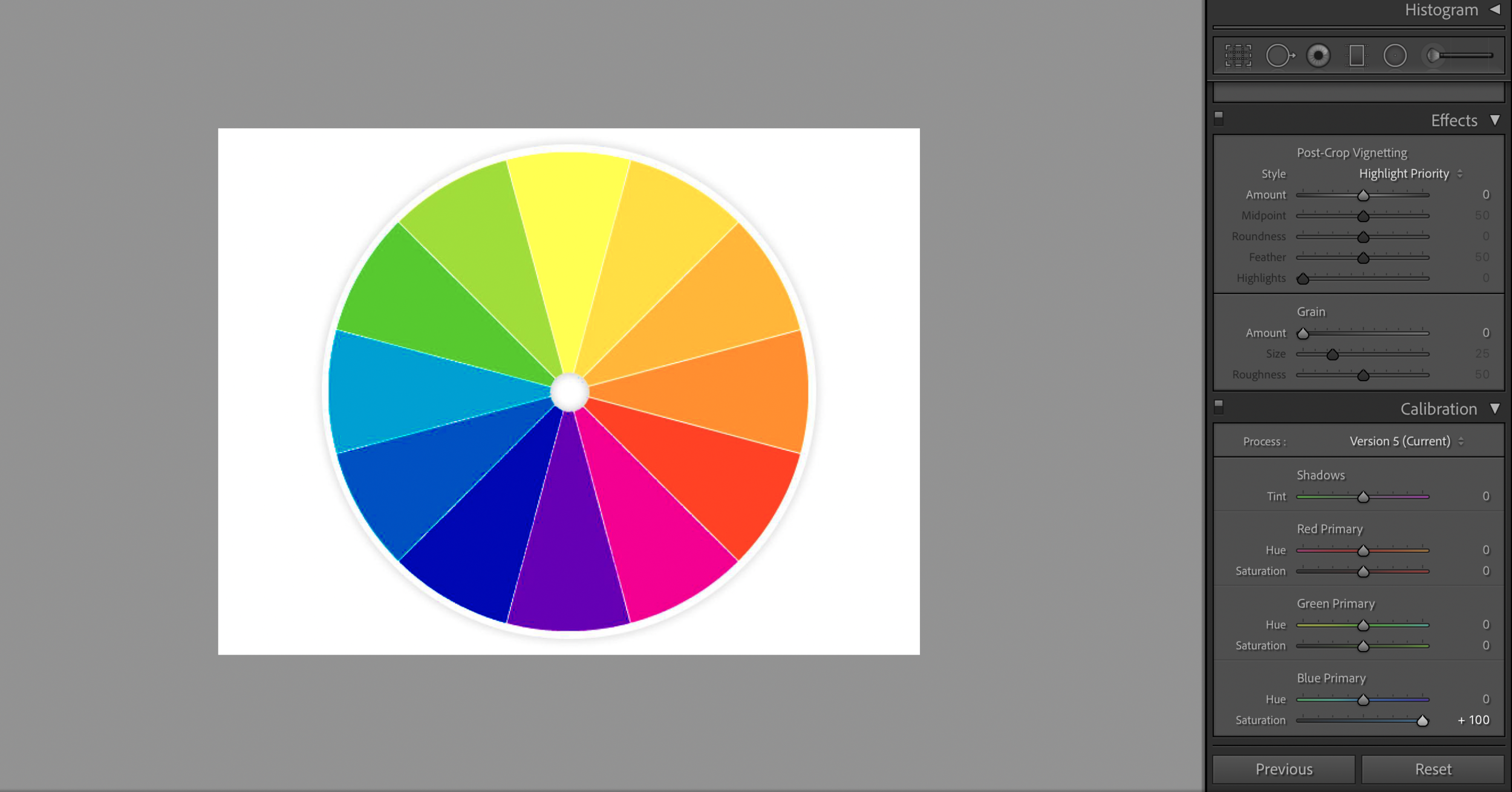
Increase Saturday in ‘Blue Primary’ by roughly an equal amount to add some of the warmer skin tones- oranges and yellows back into the image , breathing life back into the skin but without so much of the deeper reds that were there initially. Slightly increase the saturation in ‘Green Primary’ and you will need to tweak the three to get the best balance of reducing the red color cast and preserving a natural skintone.
Moving the Hue of the ‘Red Primary’ slightly to the right (roughly between +1 to +4) if the red cast is more of a deeper mauve red can help shift the reds closer to an orange red and work with the other changes to make the skin a little more natural looking- it really depends on the image whether it’s needed and how much.
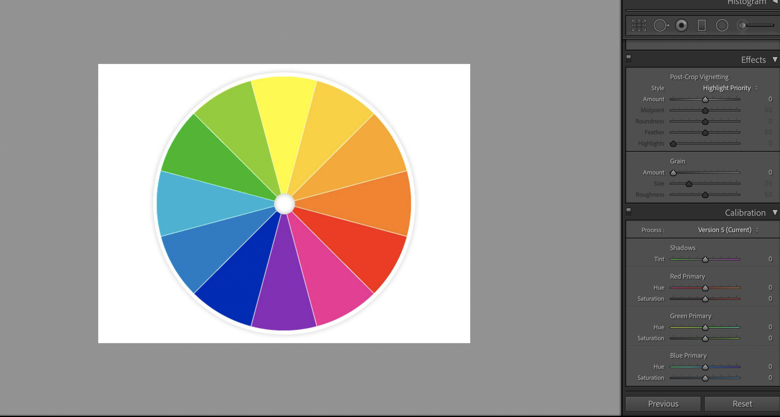
There are some colour wheels at the bottom of the post to help further illustrate what we are trying to do in Camera Calibration here.
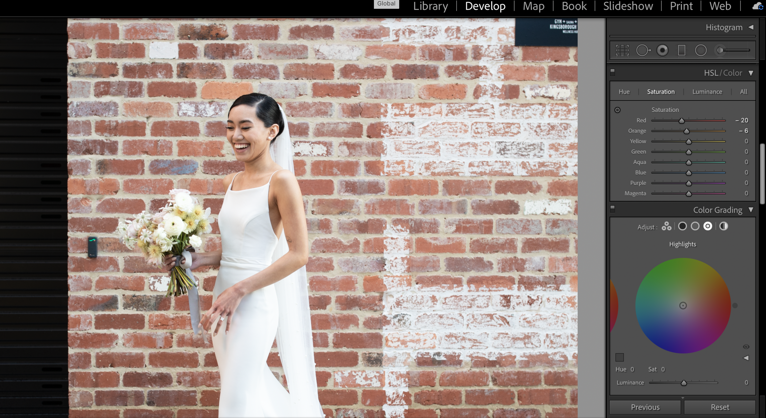
HSL slider
I find that changes in the HSL slider make less of a difference, and also are less predictable but can be helpful in conjunction with the Camera Calibration changes if you’re maxed out on those.
Reduce Saturation and / or luminance in the Red channel and (sometimes) the Orange channel
Shifting the Hue of the Red channel towards the orange (right) side
Graduated Filter
If the colour cast is concentrated on one side of the image for multiple images, it might be useful to sync across a grad filter with temperature / tint / saturation adjustments (shift both temp and tint to the left and reduce saturation)
If you would like to use a stylistic preset that already has Camera Calibration and HSL values dialled in- you would use those values as the starting point and make the above changes relative to that (for example, if the ‘Red Primary’ saturation is set as +50 in your preset, you might decrease it RELATIVE to that +50). The images below show how this process might look, using the preset ‘White Gold’

(left) straight out of camera, (middle) White Gold preset applied after basic color balance (tint / temp) and exposure adjustments (right), further adjustments in Camera Calibration and HSL as outlined above.
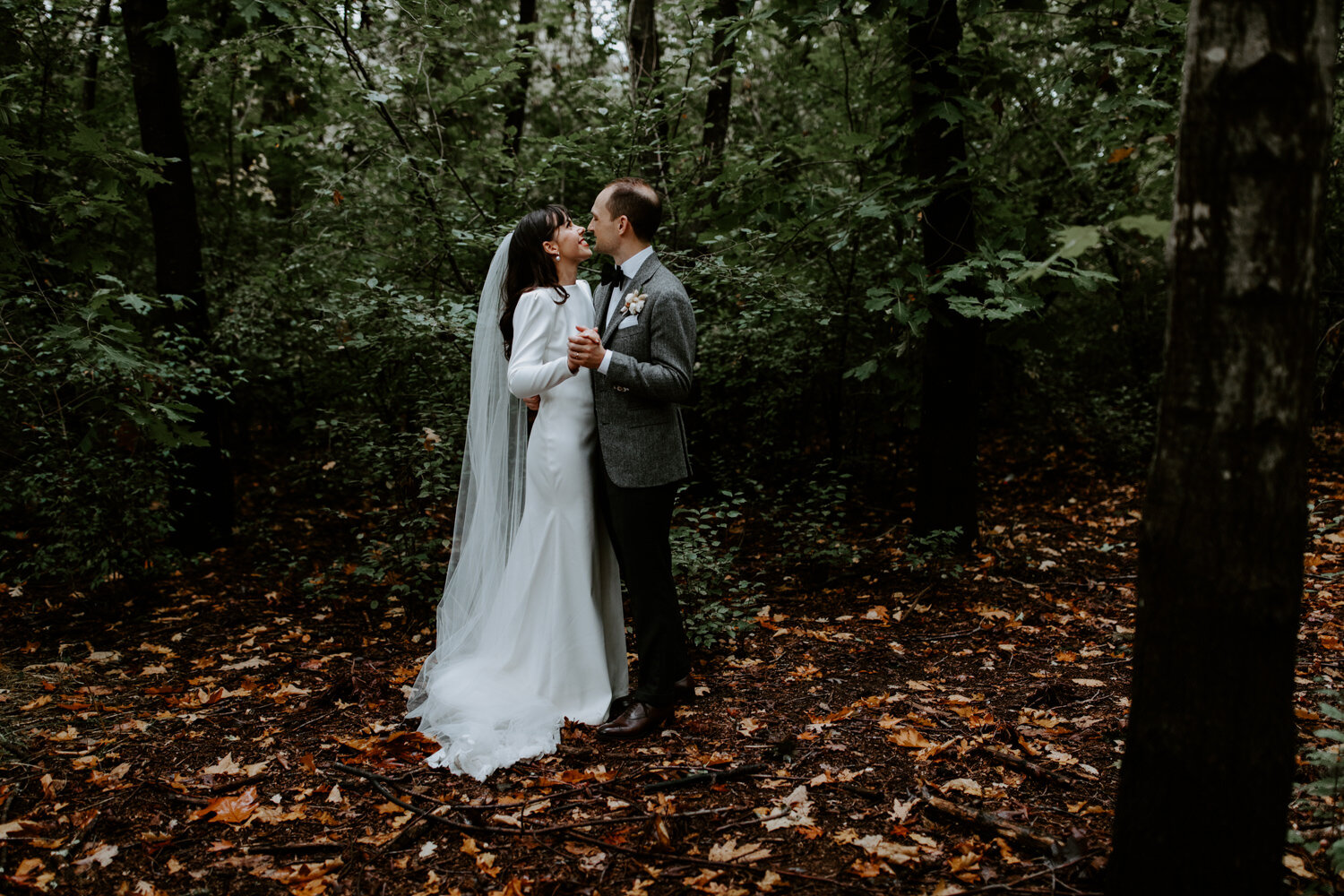
CORRECTING GREEN COLOUR CASTS

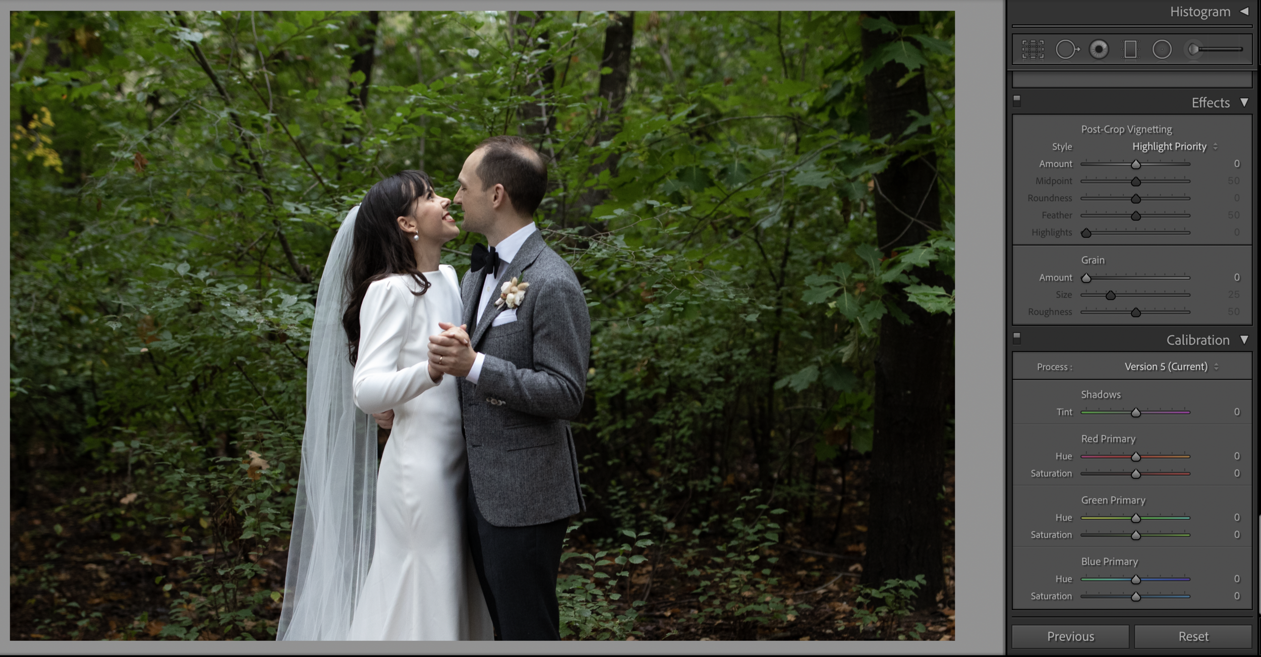
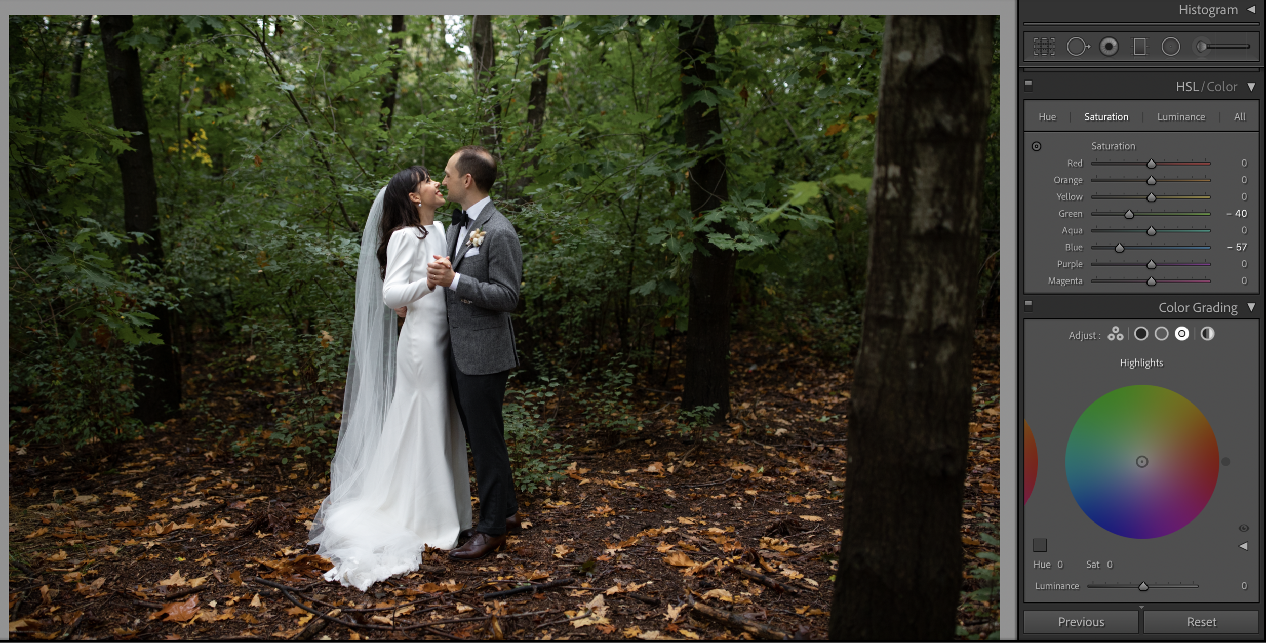

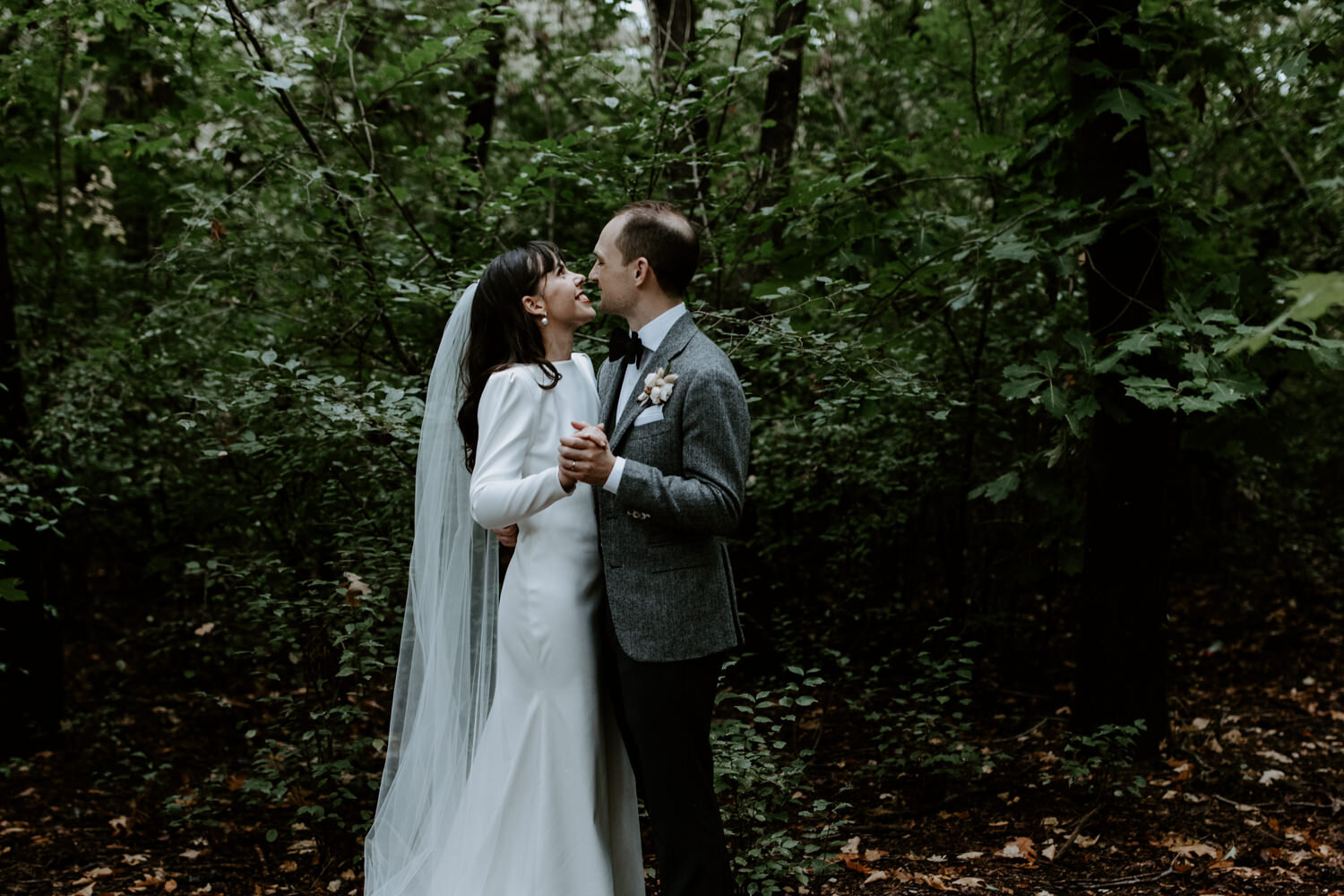
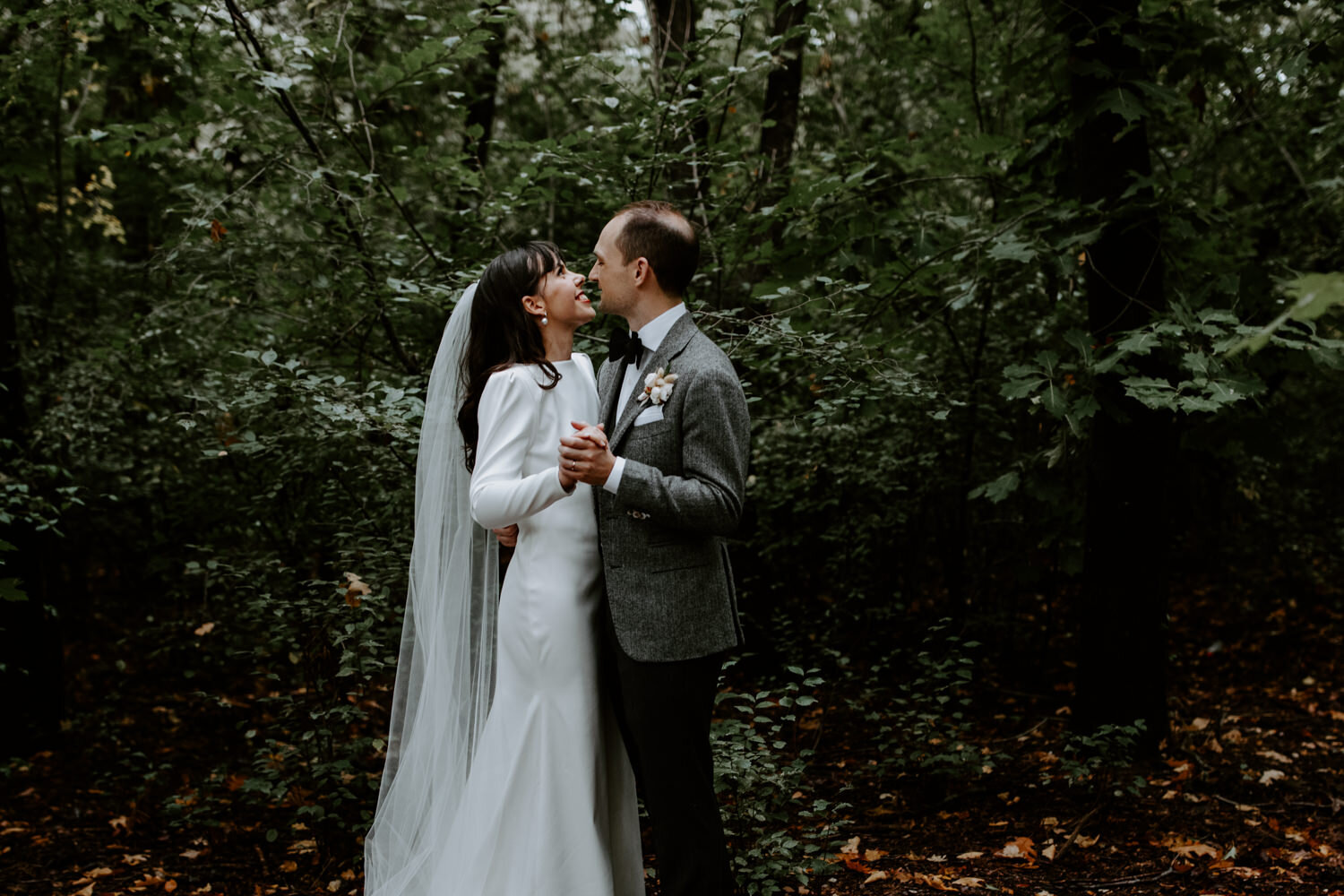
Unlike red colour casts which leads to over-saturation of skin, the main issue with green is that it cancels out warm tones, sucking the life out of skin tones. Surprisingly, reducing green tones in the image makes very little difference to how the skin looks, but increasing the saturation of warm tones is what seems to ‘fix’ the issue and restore natural looking tones to skin. You can do this in Camera Calibration as well as the HSL sliders- for this particular image both seem to work equally well, and I like using a combination of both.
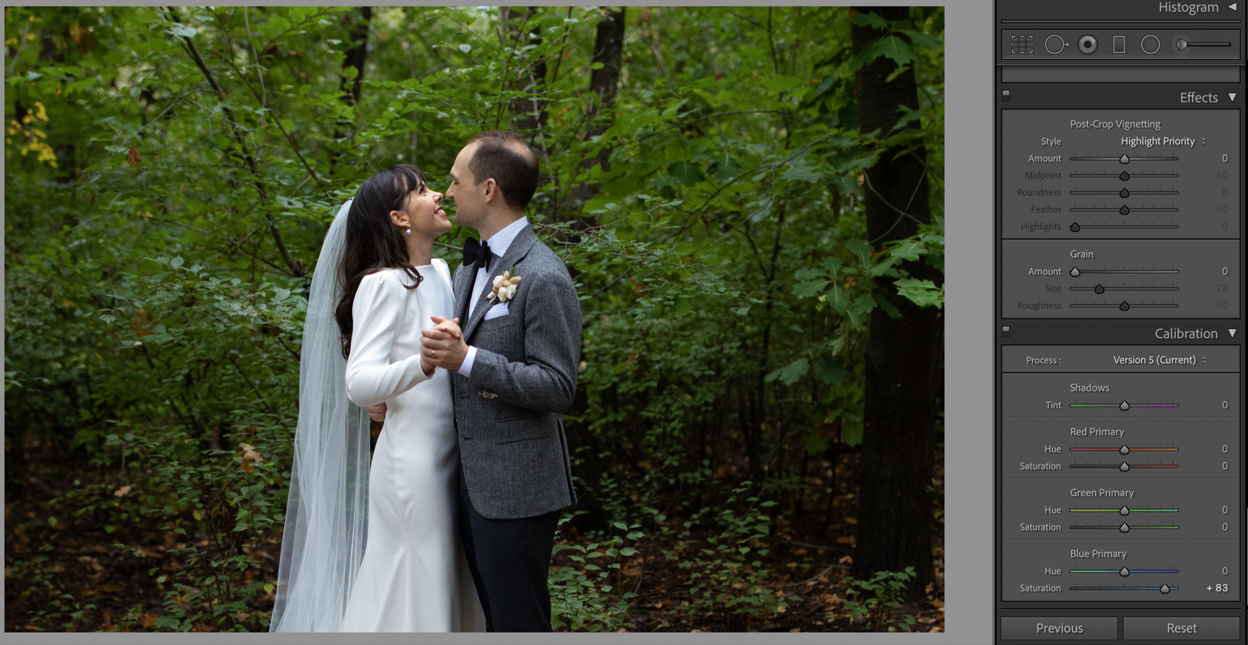
Camera Calibration
Increasing the saturation of ‘Blue Primary’ (try increasing by +50-> +100) brings back a lot of the warm tones into the skin and sometimes this alone restores normal skin tones. (try increasing by +50-> +100). If there are blues in the image, such as a blue sky, it will oversaturate the blue tones so you can counter that effectively simply by reducing the saturation of the blue channel in the HSL slider.
The other change that occurs when you increase the saturation of ‘Blue Primary’ is that all the tones (including green) tends to brighten, become more vivid, and ‘pop’ more. If this works for your image that’s another reason to use this adjustment for colour correction (vs simply just the HSL slider, which doesn’t have the same effect).
You might think that reducing the saturation in ‘Green Primary’ might help- but it actually doesn’t make much of a difference to the green cast and makes the skin look worse if anything (because it tends to desaturate the warmer tones across all pixels in addition to decreasing green).
HSL
Increasing the saturation in the red and orange sliders can bring some of the warmth back to skin- achieving a similar outcome to the skin changes in the ‘Blue Primary’ slider in Camera Calibration, except the effects are more targeted to skin tones and it doesn’t have the global effects on brightness and vividness as the Blue Primary changes would. This might be useful for some images.
Brushes / Graduated Filter
Just like for red colour casts, you could use an adjustment brush or grad filter (increase saturation, increase temp and shift tint towards magenta, paint a warmer colour on the skin with the colour tool at the bottom of the brushes adjustment panel).
The gallery above shows some snapshots of the editing process from an image straight out of camera as well as with a preset applied.
In the before/after images below, the before image is white balanced (no other colour editing), and the after image has had HSL and Camera Calibration adjustments made on top of the Lightroom Preset ‘Lifestyle 01 Warm’ (from the Lifestyle Headshots Preset Pack) - as mentioned above, you would use the Preset edits as the starting points and then make the recommended colour correction adjustments relative to those starting points.
To understand the way Camera Calibration effects colours in an image, it’s useful to look at a colour wheel - scroll through the gallery below to see in action the effects of some of the colour correcting adjustments mentioned above. As you can see, increasing the blue saturation has the interesting effect of increasing the vividness and brightness of all of the colours in. the wheel. Decreasing the saturation in the ‘Red Primary’ and increasing the saturation in ‘Blue Primary’ shifts the reds to a peachy orange tone, which is what we are aiming for when we want to get rid of a red colour cast on the skin.