F2 (BLOOM 1) preset: How To Achieve in Lightroom
NOTE: due to copyright issues, I cannot use the name VSCO so the F2 preset has been renamed 'Bloom 1' (watch out for Bloom 2 in the near future!). More info on the whole copyright debacle in this blog post.
Desaturated and understated, the F Series: Mellow / Fade presets yield elegant results. An all-purpose pack with analogue film qualities, F1, F2, and F3 excel at beautiful skin tones and quiet everyday moments- VSCO
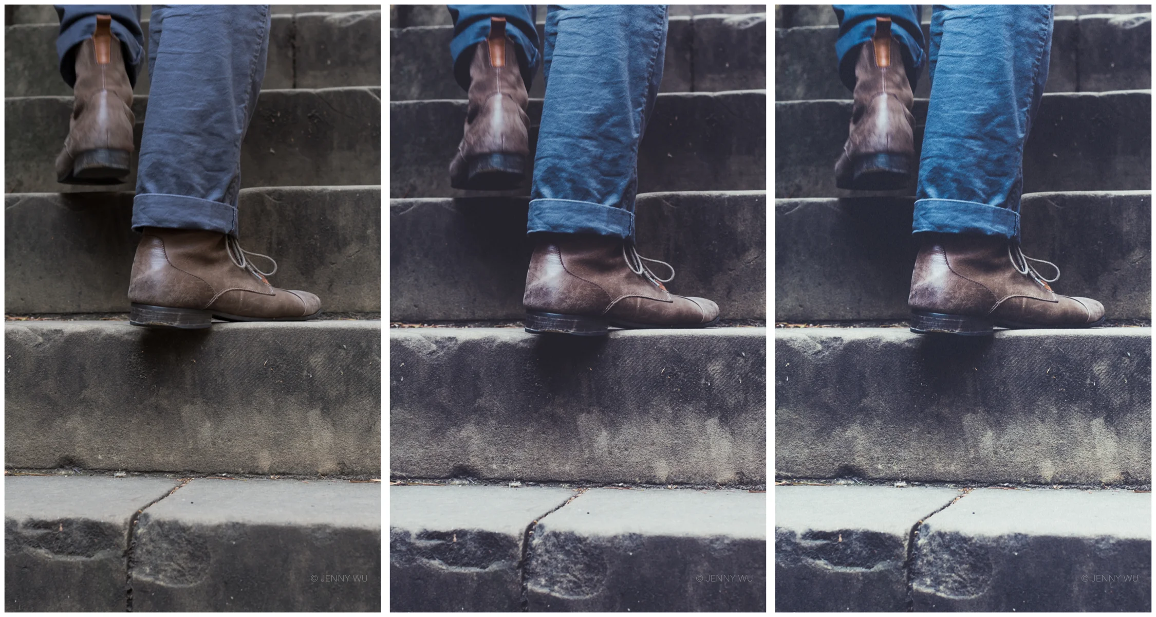
F2 from the VSCOCam F series is great for moody landscapes, edgy street photography, flat lays and any image with pink/magenta in it (awesome for floral still life photos). I find that it does not work so well with very high dynamic range images, particularly backlit portraits- but there are going to be exceptions. It has an edgy look with faded shadows, overall desaturation, vibrant magenta tones.
Along with the VSCO Cam A6, SE3 and M5 inspired Lightroom presets, this VSCOCam F2 inspired Lightroom edit is available for download at my preset store.
In VSCO Cam App there is an option of choosing different degrees of the preset for different looks, so I've aimed for the same thing in my editing. My Lightroom preset in F2- is the subtle version, F2 is the regular version, and F2+ is the increased version with more dramatic colour shifts and fading.
Tutorial: VSCO Cam F2 stylistic post processing features.
- Crushed and faded blacks- in Lightroom I get this effect by pulling the black slider far off to the left thereby darkening the shadows, and also going to the tone curve and pulling the blacks up. This 'crushes' the details in the shadows as well as creating a subtle fade.
- subtle highlight fade- in Lightroom I pull down the top right corner in the tone curve slightly down
- high midtone to shadow contrast: S shaped tone curve, with the curvature changes most dramatic in the darker parts of the curve.
- low contrast in the brighter tones- raising the shadows and whites in the basic panel, together with the slight fading of the highlights in the tone curve gets rid of a lot of the contrast detail in those tones.
- colour shifts and split toning: the magenta pop (the most noticable colour shift in this preset to my eye) that comes through with images that have pinks and purples can be achieved by shifting the pinks into magenta and the pinks to purple in the HSL panel. Orange, greens, and aqua tones are also shifted in Hue panel. I've added a bluish tinge to the faded shadows by adding a bluish magenta tone in the split toning panel.
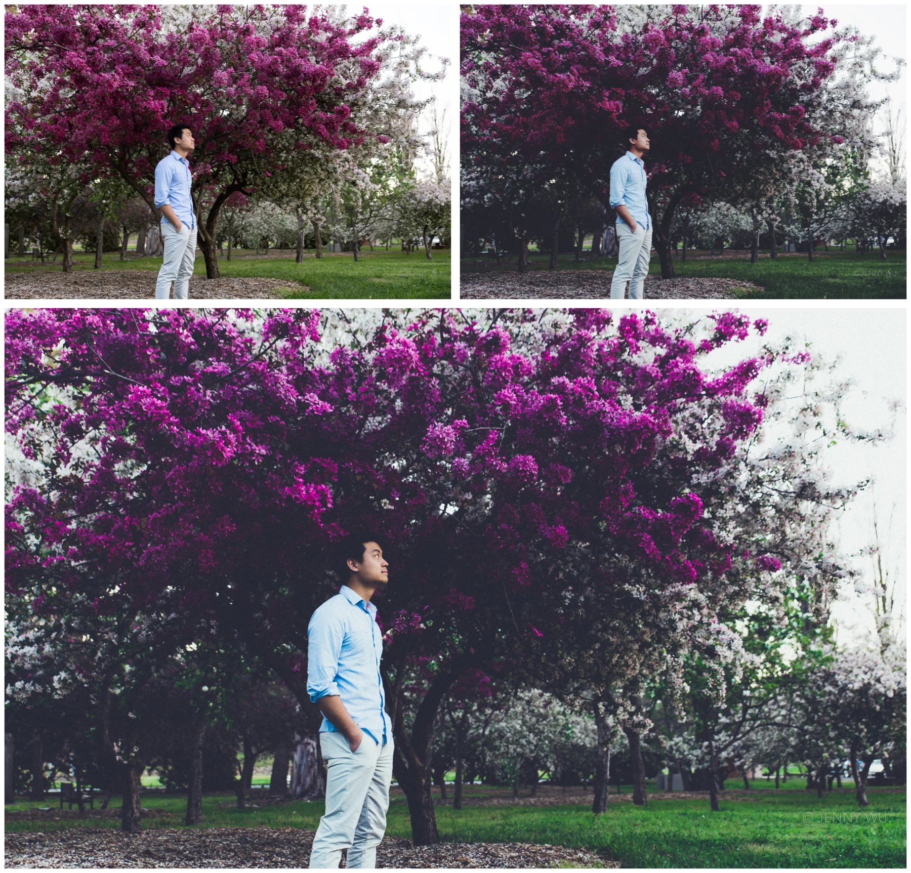
Springtime in Canberra. Top left- unedited Jpeg, top right- VSCO Cam app F2 preset, bottom- F2+ Lightroom preset
Lightroom F2 preset comparison: unedited, F2--, F2-, F2 (clockwise from top left)
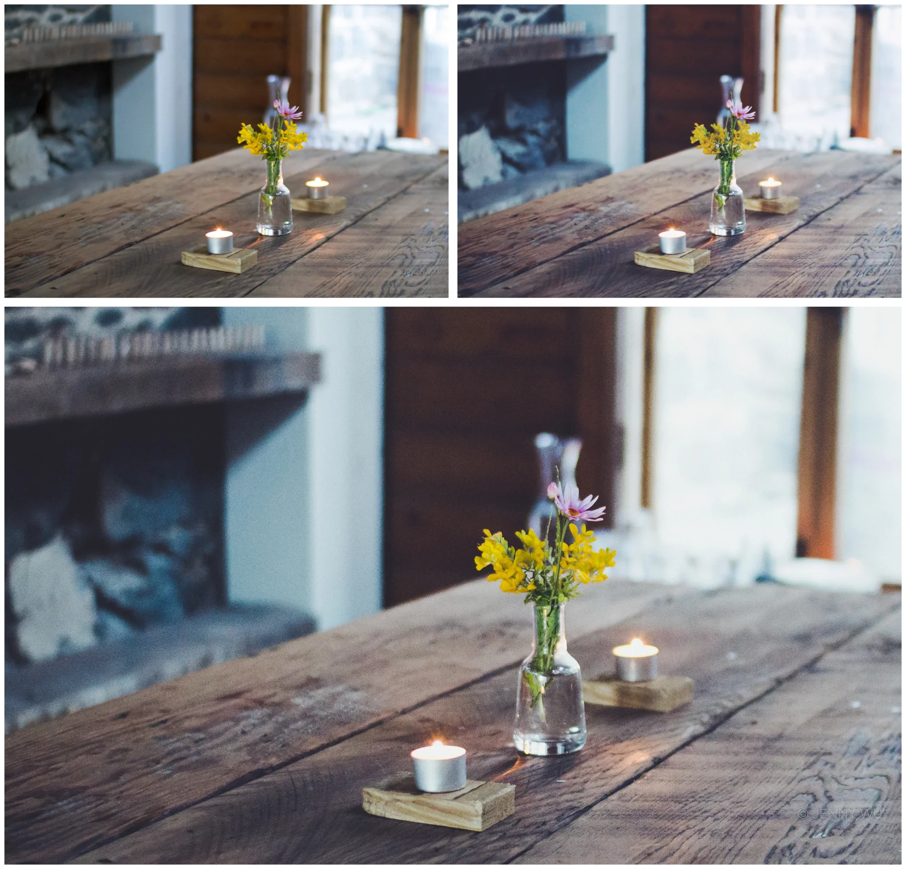
Cafe at the end of the Great Ocean Road. Top left- unedited Jpeg, top right- VSCO Cam app F2 preset, bottom- F2 Lightroom preset
Lotus flowers at a Cambodian market. Jpeg straight out of camera (left), F2 (middle), F+ (right)
Baked eggs. Top left- unedited Jpeg, top right- VSCO Cam app F2 preset, bottom- F2 Lightroom preset
Battery Point, Hobart. Jpeg straight out of camera (left), F2 (middle), F+ (right)
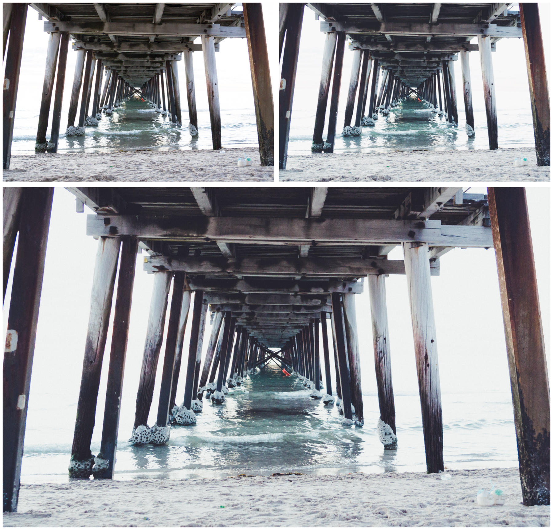
Adelaide. Top left- unedited Jpeg, top right- VSCO Cam app F2 preset, bottom- F2 Lightroom preset
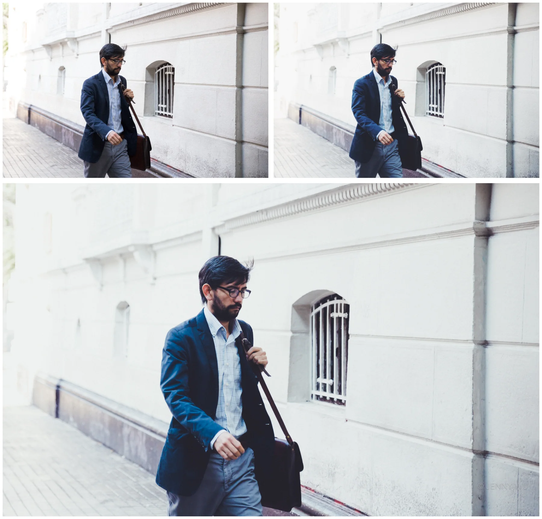
Top left- unedited Jpeg, top right- VSCO Cam app F2 preset, bottom- F2+ Lightroom preset
VSCO Cam inspired Lightroom Editing comparison: Unedited, M5, SE3, F2 (clockwise from top left)
I currently have A6, M5, SE3, and F2 available for download at my Etsy store. If you do end up downloading any of my presets, I would love to see your work edited with the presets. Email or tag me via social media and I will feature your work on my Facebook page.

